The monitoring paradox: more tools, more dashboards, and somehow more surprises
8th July 2026
2 Minute Read
Here is a pattern that plays out in almost every large IT estate.
A gap appears in visibility, so a tool is bought to fill it. Then another gap, another tool. Over the years the network team gets its monitoring, the infrastructure team gets theirs, the application team adds a couple more, and the cloud migration brings its own. Every one of these decisions was sensible in isolation. Each tool does exactly what it was bought to do.
And yet, after all that investment, incidents still arrive as surprises. That is the paradox: more monitoring has not produced more clarity. In many organisations it has produced the opposite.
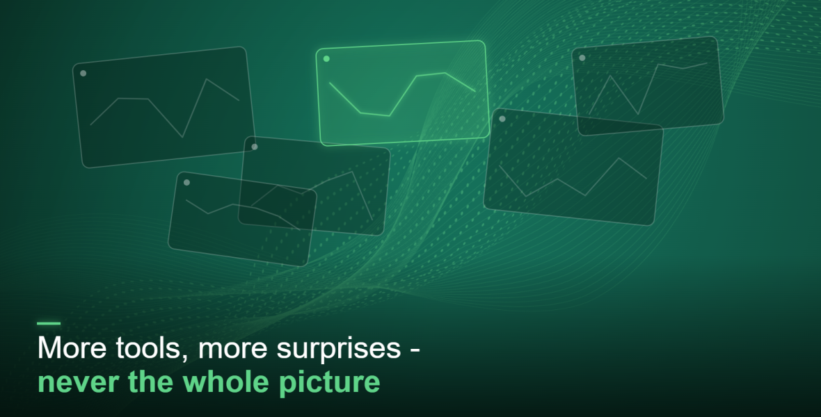
The reason is structural, not a failure of any individual tool. Each tool sees its own slice of the world and nothing beyond it. The network tool knows about the network; it knows nothing about the application logic depending on it. The infrastructure tool sees the host, not the customer journey running across it. So when a fault behaves the way faults in distributed systems always behave, rippling across services and jumping between layers, no single tool holds the whole story. Your team is left assembling a picture from fragments, in real time, under pressure. That is not visibility. It is a jigsaw with half the pieces face down.
Tool sprawl adds insult to injury on two fronts the board cares about. There is cost: licensing, integration, and the human overhead of maintaining and switching between a dozen consoles. And there is risk: the more fragmented the view, the longer it takes to understand an incident, and the more likely something falls through the gaps between systems.
The instinct, when the picture is unclear, is to buy another tool. But a tenth dashboard does not resolve the problem; it adds another slice to a view that is already too sliced. What actually closes the gap is consolidation and correlation: bringing the signals you already collect, the metrics, logs and traces, into one place, with the context that links them, so a problem in one service can be traced through to its effect on everything else and on the customer.
This is also where the commercial case gets easy to make. Rationalising overlapping tools into a single, correlated view usually reduces cost and reduces risk at the same time, a rare combination and a persuasive one in a budget conversation.
So before the next tool goes on the shopping list, it is worth counting the ones already in place and asking an honest question: would a tenth dashboard actually help us understand an incident faster. If the answer is no, the problem was never a missing tool. It was a missing picture.
If you are wondering whether your tools are adding clarity or just cost, an Observability Discovery from VCG maps where your monitoring overlaps, where the gaps are, and where correlation would help most.
→ Book a free Observability Discovery | info@vcg.group | 0161 406 1820
Exploring observability further? Join us in London in September 2026 - an event for technology leaders on how unified observability drives operational resilience and commercial performance.
Latest Insights
Resource, Insight and guides from industry thought leaders.